
why colour analysis?
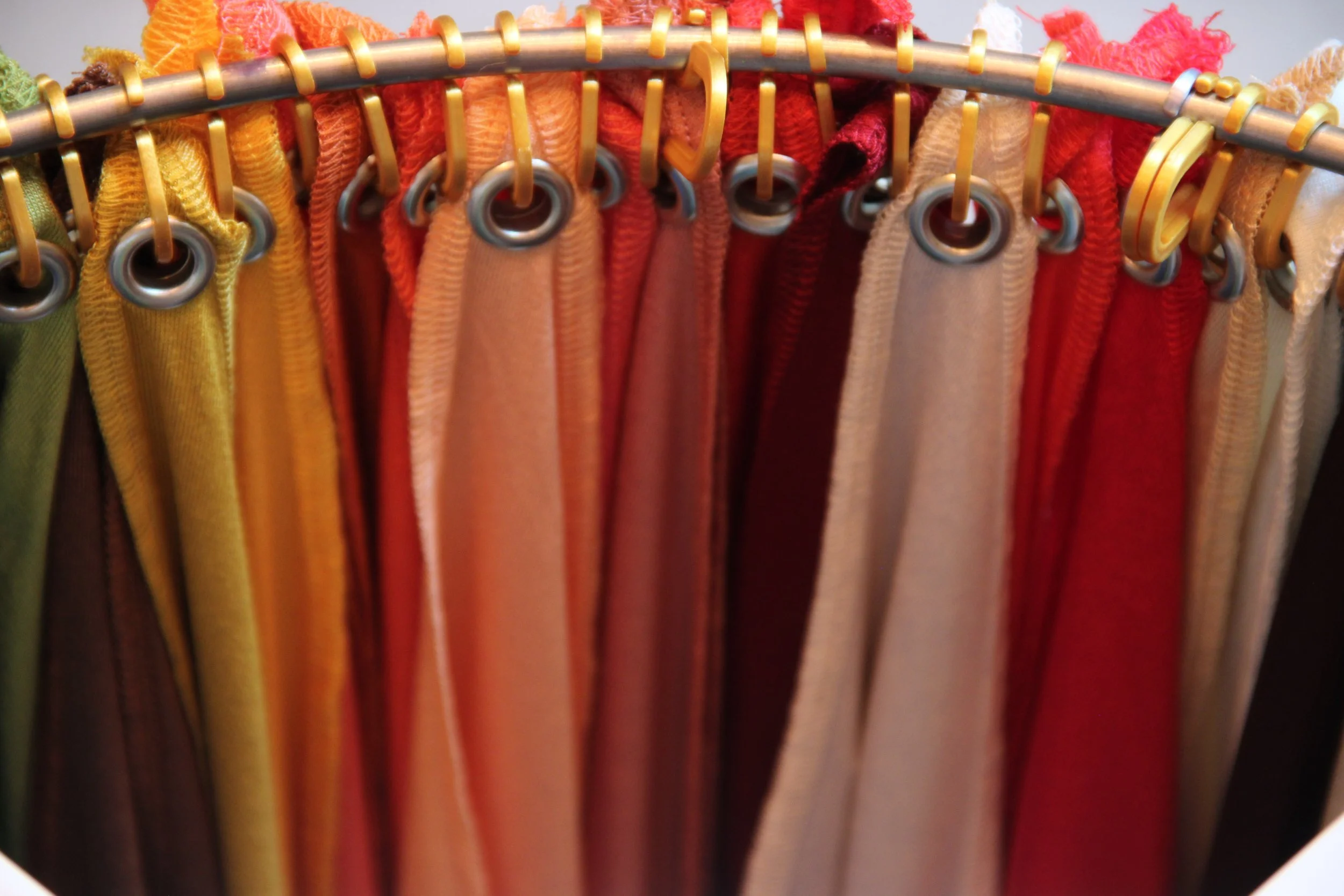
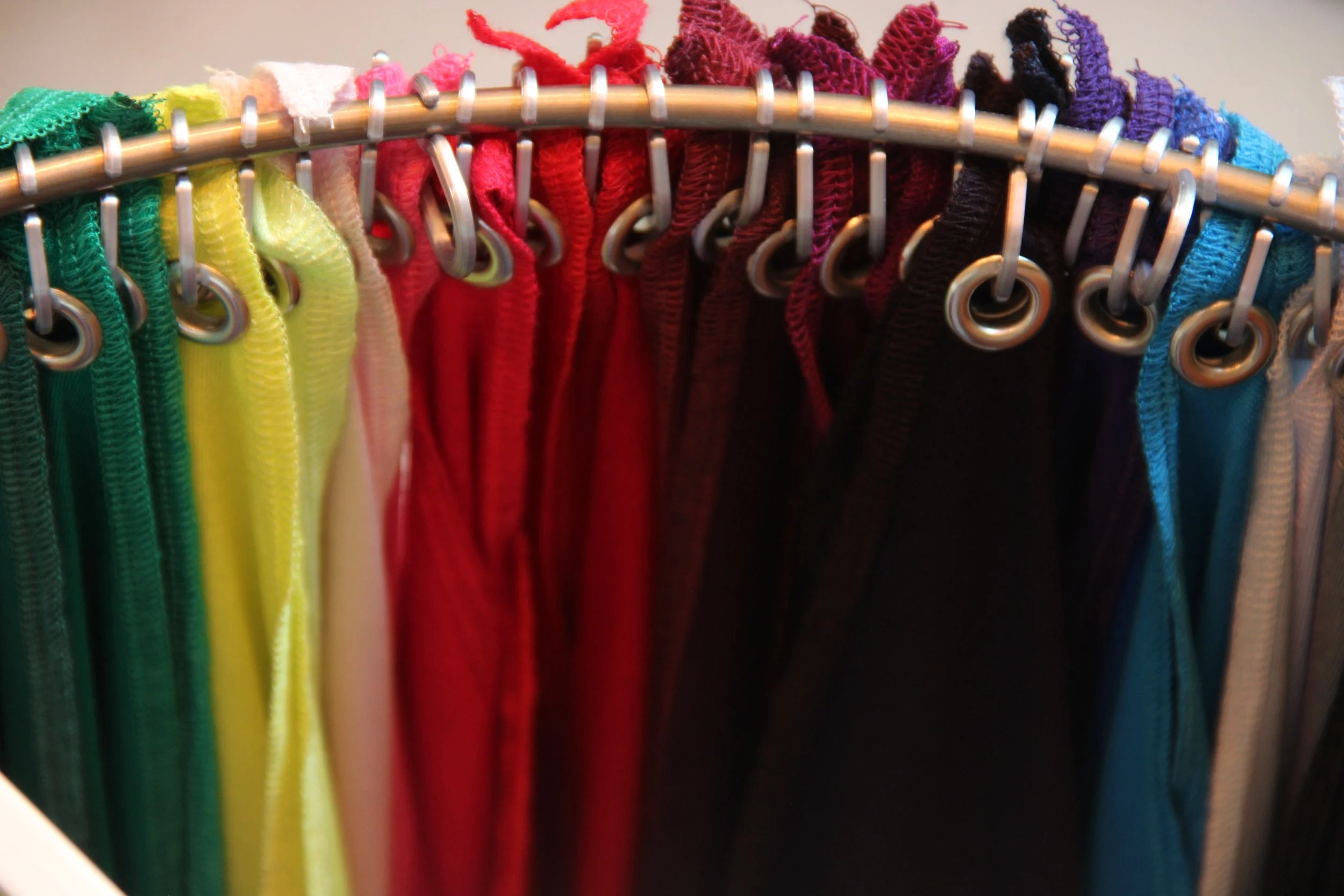
unsure which colours are your best?
wardrobe full of pieces that won’t easily make outfits?
stuck in a rut wearing just a few colours?
The aim of colour analysis is to identify a cohesive palette of colours that harmonise best with your natural skin tone - and to learn why some hues work less well for you. With this knowledge, you can confidently look and feel your best every day.
Having a cohesive palette in your wardrobe makes it easier to mix items of clothing, as all the colours relate to each other. This gives you more options with fewer items, reducing decision fatigue and allowing you to afford great-quality pieces that will last. And knowing your colours helps to reduce overwhelm while shopping, as you can quickly scan a store and zoom in on the best options.
Better yet, if you forget to do that laundry load, you’ve more chance of putting together a coordinated look from the pieces hanging up: you can rely on your wardrobe to serve your needs. And best of all, a cohesive palette should reduce waste by helping you to avoid classic shopping mistakes - the sale purchase you never wore, or the second T-shirt you don’t reach for as often as the first.
At the other extreme, if you’re stuck with just a few safe shades on endless rotation, understanding which colours look amazing on you can give you the confidence to add new hues and combinations. Analysis typically uncovers shades you never realised would give you that inner glow - and make you feel fantastic. The aim is to get a dopamine hit every time you pull a much-loved item from your wardrobe, not just when you buy it.
what is the process?
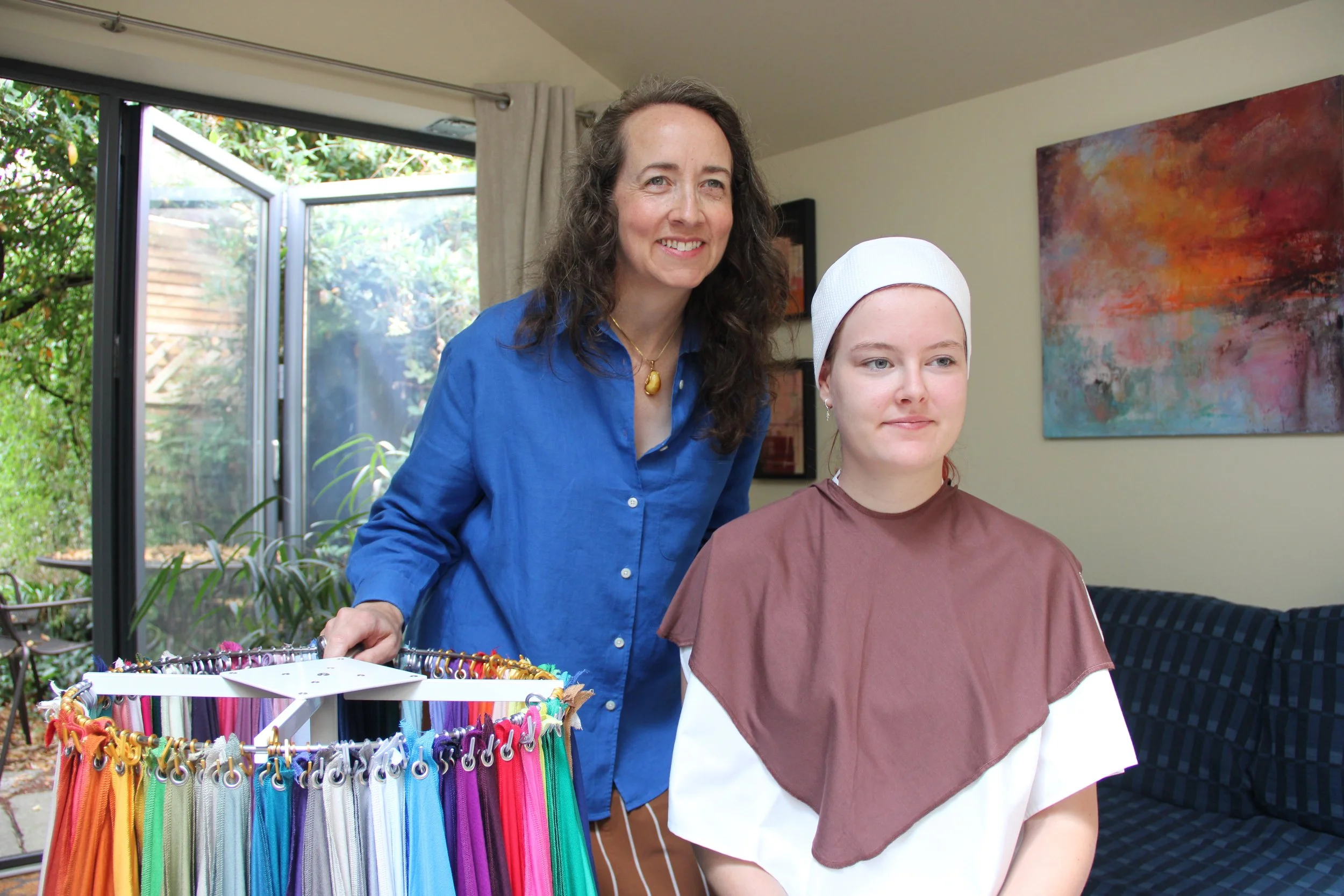
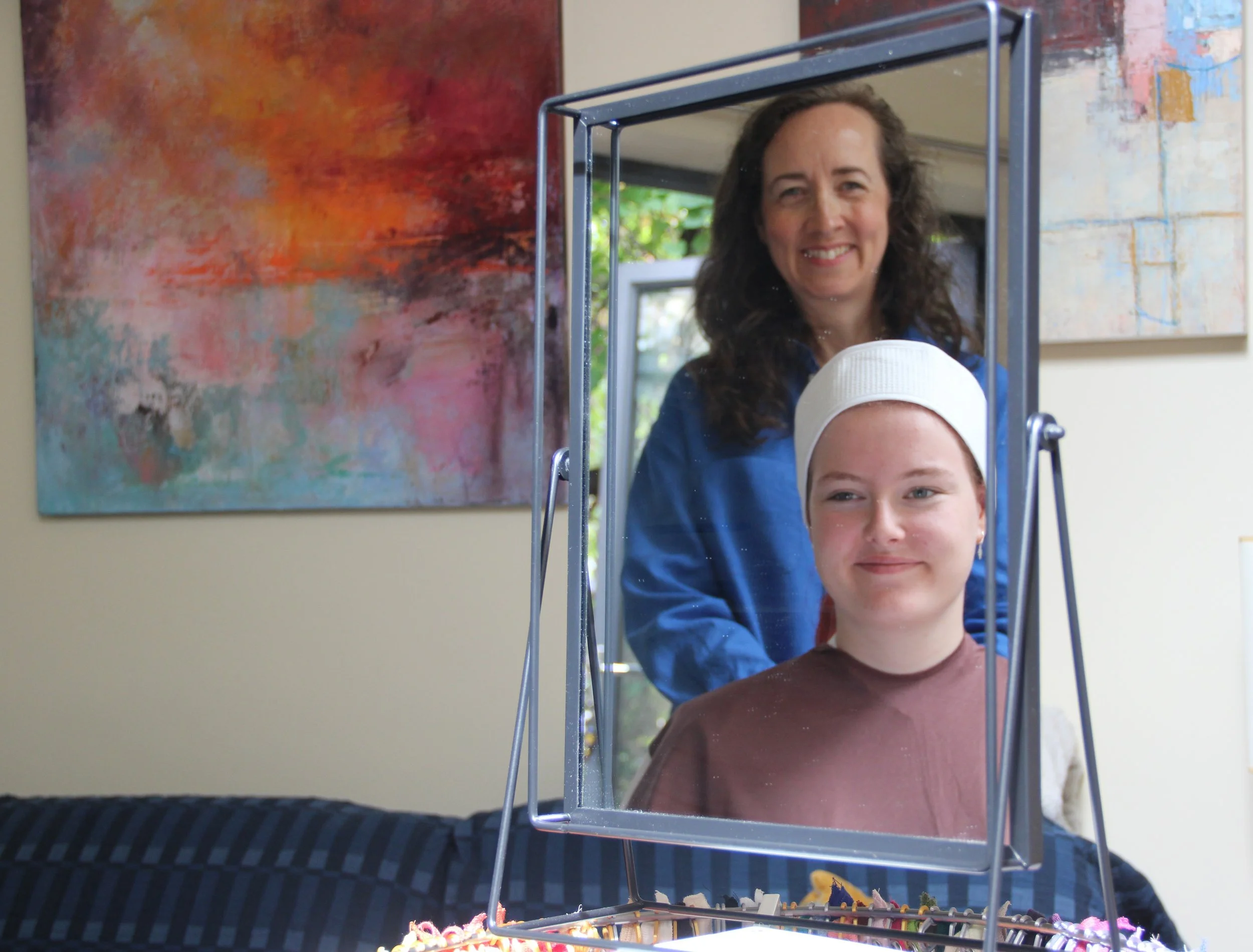
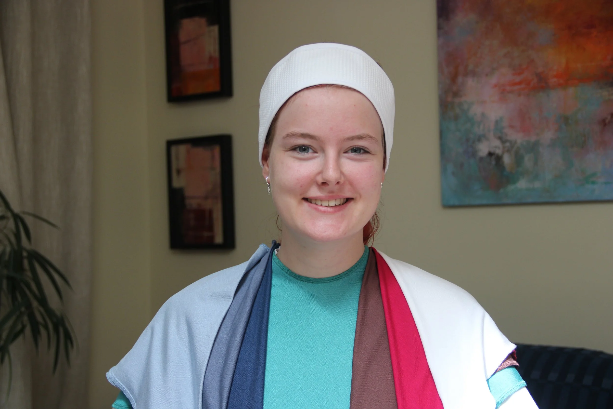
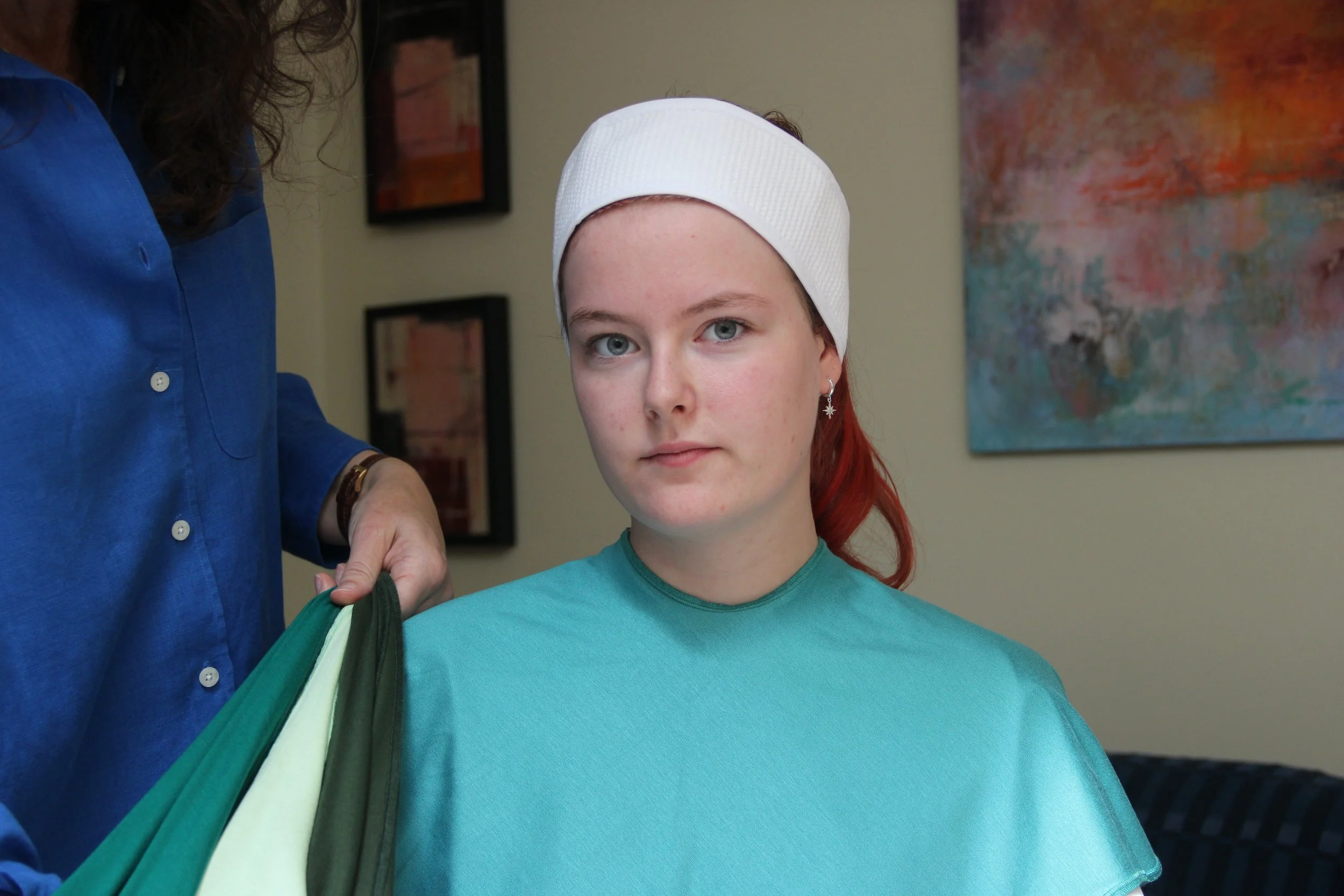
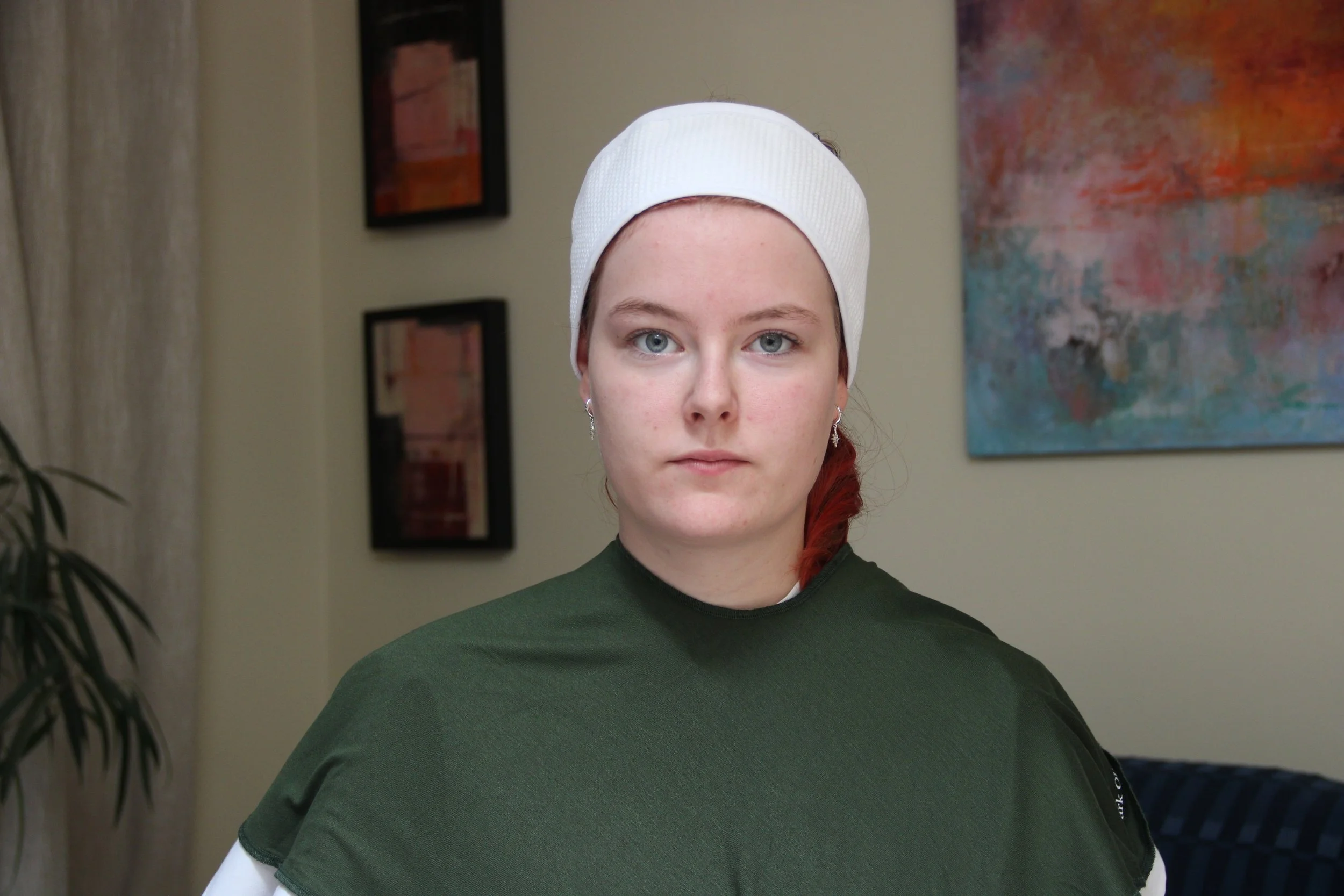
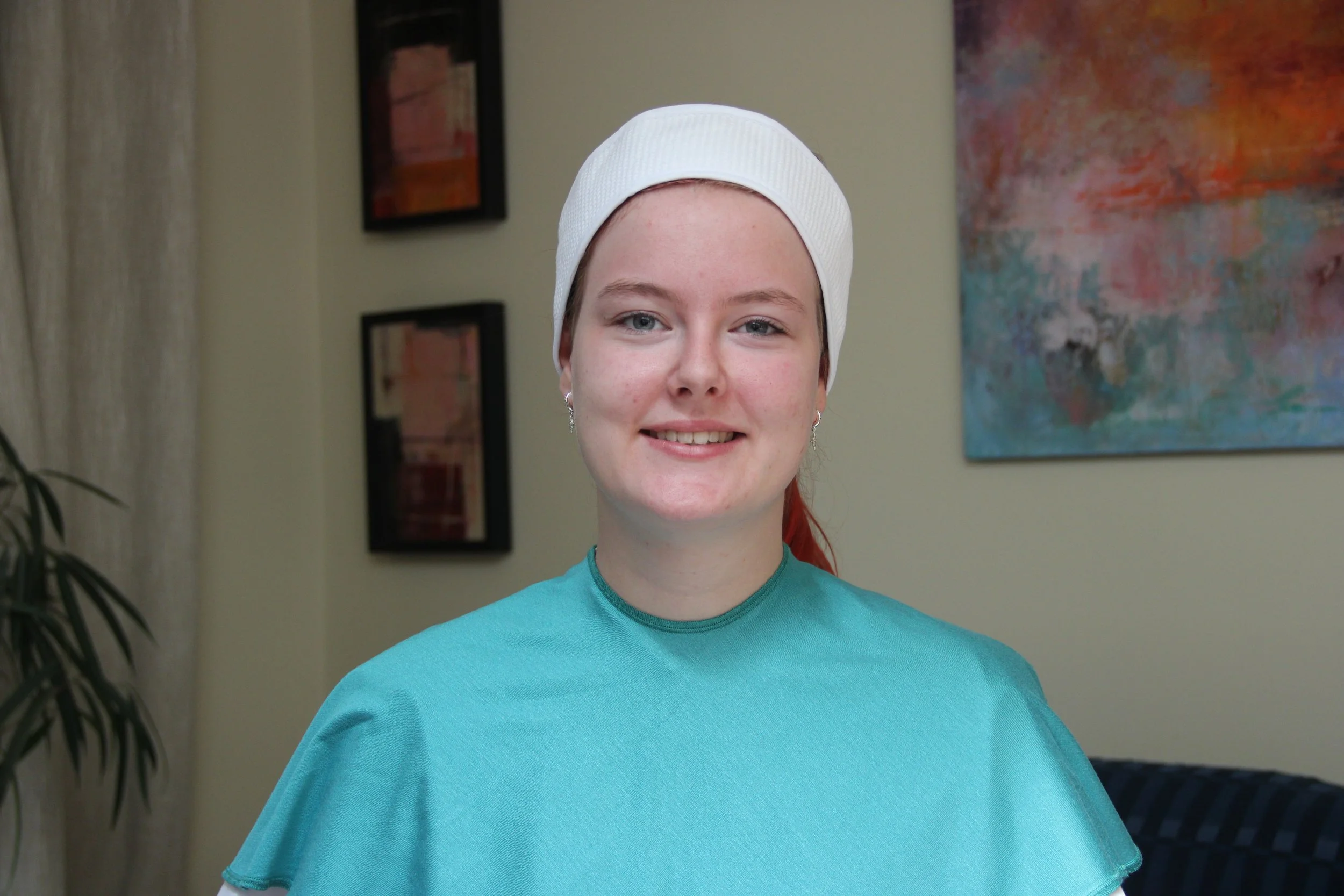
Through a process known as “draping”, we will test swatches of coloured fabric against your skin in natural daylight. A white spa-style headband can cover dyed hair so we can focus on your skin. You will see for yourself the effect of each colour on your complexion in the mirror - and at no point will I tell you what you can and cannot wear!
There is a popular myth that colour analysts tell people they “cannot wear that colour” or “must wear more of that shade”. No doubt some analysts take this overbearing approach, but I firmly believe control over what you choose to wear stays with you! The reality is that once you have seen your best colours for yourself, you cannot unsee the difference they make to you and your confidence - even a simple neutral colour.
I will help you discover which colours work best for you, not because I tell you, but because you learn to see the difference for yourself in the mirror. Sometimes you will see the difference for yourself - instantly - but where it is more subtle, I can guide you to where the differences are visible. Rosacea, acne and unevenness can all be diminished by the right colours.
The draping process is inclusive and works for all skin tones and types, all ethnicities and genders. Whether your skin tone is deep, mixed heritage, olive or fair, the draping process is the same. Beards, facial hair or religious head coverings do not need to be removed.
Of course we will consider your best neutrals too - from pure black and white through different versions of grey, cream, brown and navy.
How detailed we get about which specific colours work best for you depends how deep you want to dive into colour analysis. You can choose the “four seasons” system for an easy introduction, go into greater detail with the “16 sub-seasons” system, or opt for a fully personalised capsule colour palette.
You can read on to find out more - or, if you’re ready, you can choose the personal colour analysis service you need.
what are the ‘four seasons’?
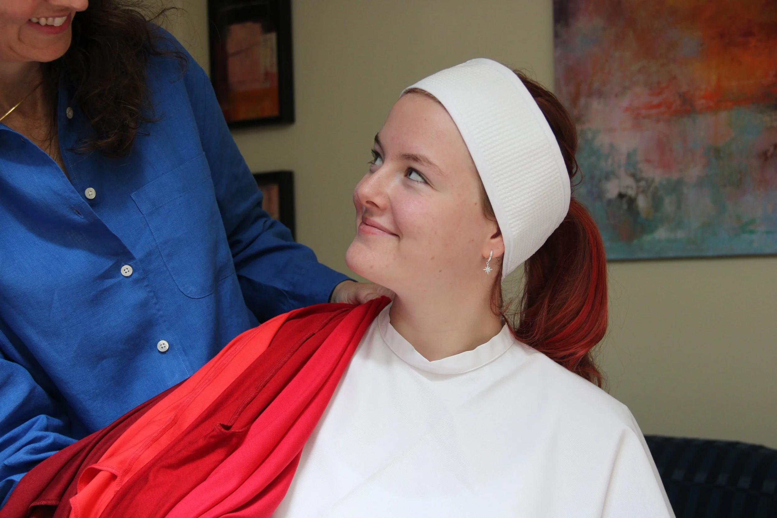
In the simplest colour analysis system, there are just four colour palettes, dubbed “seasons” because they loosely map to hues found in nature each season. One of these will be your “home season”, containing the types of colour that look most harmonious on you. It’s a colourful shorthand:
Spring - warm, bright, fresh, new shoots, first flowers
Summer - cool, soft, beautifully faded or hazy
Autumn - warm, rich, earthy, falling leaves, sunsets
Winter - cool, bright, crisp, evergreen, jewel tones
All four “seasons” contain versions of all the colours: different purples, blues, greens and so on across the rainbow, with deeper and paler options. Versions of each neutral - your best whites, greys, navy and browns - are also found in every seasonal palette.
Colour analysis is about identifying which shade of each colour is your most harmonious option, not about ruling colours out. For example, if you love red, there is a bold red in each palette. Autumn’s red is a rich brick, Spring’s is a clear scarlet, Winter’s is a bold crimson and Summer’s is a soft cherry. Together we will discover which shade makes you feel confident and radiant, rather than overpowered and grey.
You can find versatile neutrals and accent colours in each palette. The colours harmonise within each seasonal palette, allowing you to put together outfits with ease.
If there is a colour you particularly love, but it doesn’t seem to love you back, we can discuss how to make it work. We can also look at which jewellery metals, such as gold, silver or rose gold, look most harmonious with your palette.
If you want a simple, satisfying introduction to colour analysis, my “home season” service is right for you.
“And who knew there is actually a ‘yellow’ that works for me as I had always assumed all yellows were the same so I had totally avoided them” - Mel
what is the ‘16 sub-seasons’ system?
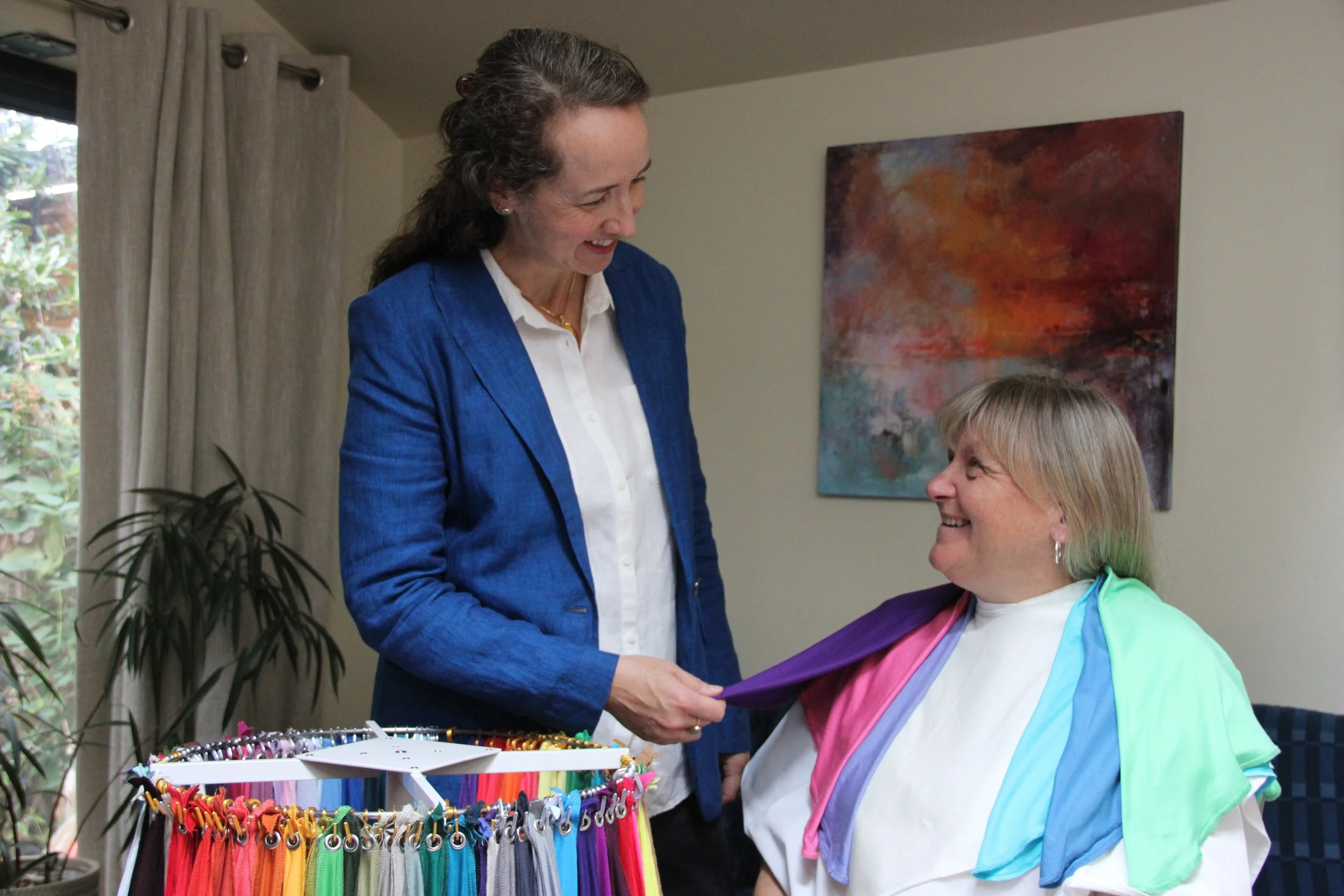
Colour analysis aims to expand your knowledge of colours that work for you, not limit it! To discover which colours within your seasonal palette are your absolute best - and which colours you can “borrow” from another season without disrupting the harmony of your palette - the “16 sub-seasons” system gives you the next level of detail. Each season is broken down into four sub-seasons, which will reveal how dominant each of your season’s key characteristics are for you.
For example, someone who suits a Winter palette could sit in the middle of this palette as a “True Winter”, with no particularly dominant characteristic. Alternatively, they might suit the coolest, deepest or clearest colours in the palette as “Cool Winter”, “Deep Winter” or “Clear Winter” respectively. Continuing this example, a Deep Winter can often “borrow” some of Autumn’s deepest colours, such as espresso and deep teal, integrating these into their palette of deep jewel tones such as emerald and claret. The “16 sub-seasons” system provides a much more personalised approach.
We will also identify a handful of key shades that make you feel your most confident, like a star - your “star colours”. These are the colours that would make a fantastic choice for purchases you will wear regularly, such as a winter coat, or when you want to feel your best at a special occasion.
If you would like this level of detail, choose my 16 sub-seasons service.
what is a capsule colour palette?
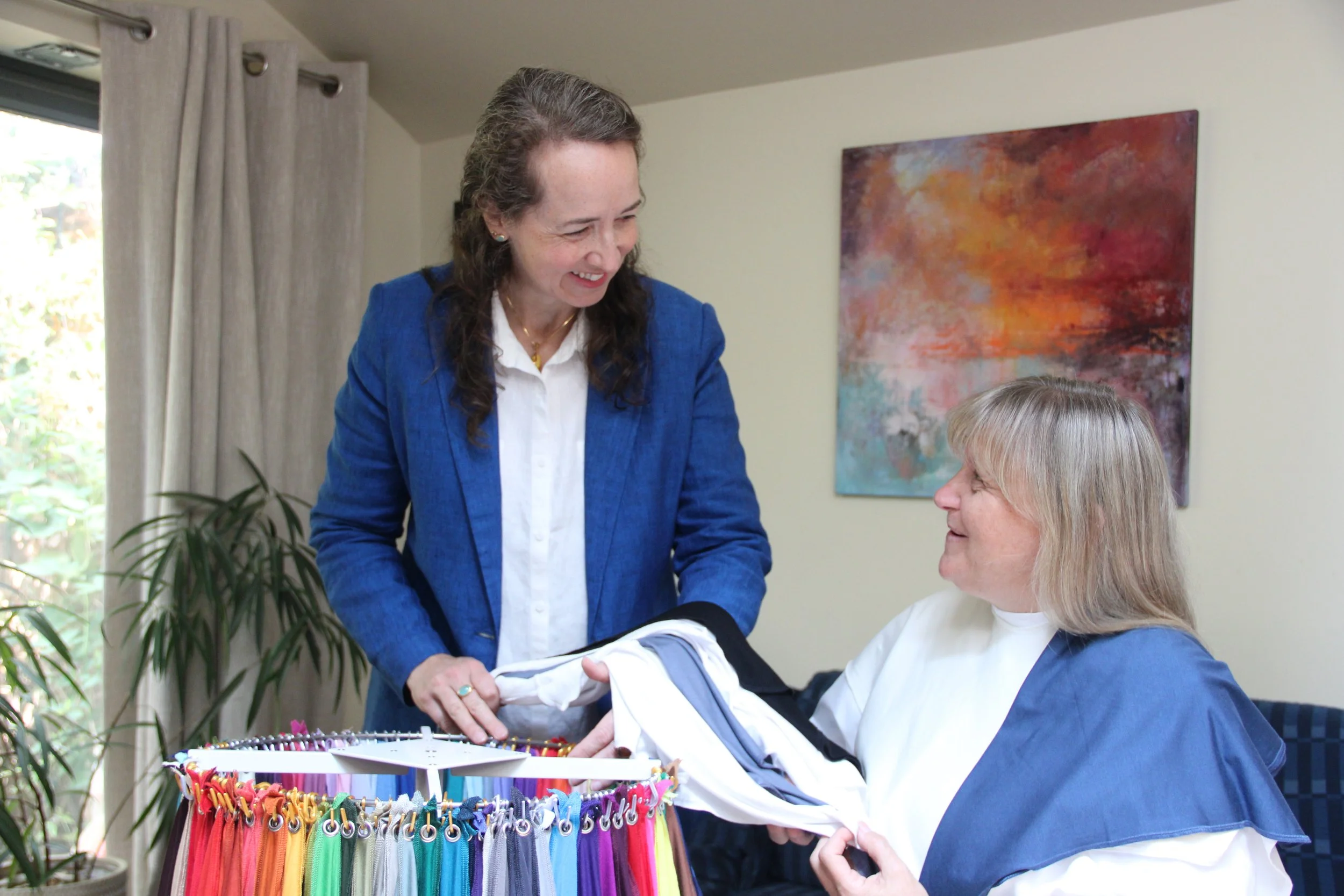
If you want to reduce decision fatigue while feeling confident and perfectly put together, identifying versatile capsule palettes for specific needs may be the answer. We will use your star colours and sub-season to your best advantage.
Perhaps you need:
an easily mixable capsule wardrobe for work, so you always feel confident that you are well presented - whether you did laundry at the weekend or not!
efficient packing for your holiday without running out of options by the end of the trip
to navigate a busy festive period without blowing your budget on lots of single pieces
Together we can build an appropriate palette of neutrals and accent colours that you will feel confident combining. For each type of occasion, we can draw on the psychology of colour and its effect on our mental and physical state.
If you are ready to simplify decision-making and look your best with ease, please review my bespoke colour capsule service and we can create a tailored plan.
why can’t this be done online?
Despite all the claims, the draping process simply cannot be replicated by submitting a photo to an online service or AI. If you’ve tried your favourite chatbot, or an online draping service or two, you may have found that you get different results from different services, creating even more confusion. A digital service is inherently inaccurate and cannot reveal the whole picture, which is why you will usually find a range of results, none of which will be precise.
Every combination of camera lens quality, lighting in that moment, image processing software, decoding software, the viewer’s computer screen and its settings is unique. This means it is impossible to tell how your skin and fabric colours would really look in natural daylight compared to how they appear on someone else’s screen.
In addition, when you physically put on clothes, you are looking at light reflected onto your skin from different-coloured fabrics under your face. You may recall from physics lessons that the colour we see on the fabric is the colour of light that is being reflected by the surface. This light shines up onto our skin, making us look anything from radiant and glowing to washed-out and unwell, depending on our individual skin tone. Such reflection of light cannot happen when a photograph is simply positioned next to blocks of colour on a screen. So you cannot replicate from photographs how coloured light behaves in reality.
Out of curiosity, I recently tested some online services for myself, and was variously analysed as Spring, Summer and Autumn, reflecting the confusion I’ve been told about by others who’ve tried these services.
At worst, one online service claimed I was a Soft Summer and should wear soft, cool colours in a muted and gently blended palette; these are the colours and combinations that make me look most unwell. I suit the exact opposite, the brightest warm colours of Clear Spring, with the high contrast of Clear Winter!
This experience also demonstrates that when submitting a photo, you learn nothing about how colours look against your own skin - neither myself nor the analysts learned how these colours actually look on me. An analyst is effectively telling you what to do without building your own understanding, and this is not how professional colour analysis should work.
This is why I offer draping in person, in natural daylight. It is the only way to get an accurate picture and the only way to learn how colours work for you.
Explore the range of colour analysis services now to find the one that gives you the information you need.
If you have further questions, or any accessibility difficulties with this process or with visiting my studio, please get in touch and we can discuss options to give you the best possible experience.